Class Meeting 23 (9) DashR: Multi-level callbacks and layouts
This lecture is 100% complete.
23.1 Today’s Agenda (10 mins)
- Announcements:
- Assignment 05 and Milestone 05 have now been posted
- Part 1: Effective Dashboards [25 mins]
- Principles of effective dashboards
- Other considerations for building dashboards
- Examples of effective dashboards
- Part 2: Multi-level callbacks in Dash [30 mins]
- Example 1: Linking two graphs together with clicks (by Sirine)
- Example 2: (Optional) Extra example linking graphs together (by Sirine)
- Part 3: Preview of Layouts in Dash [10 mins]
- Demo of layout possibilities
- Link to layout templates (by Matthew)
23.1.1 Lecture Learning Objecives
By the end of this class you will :
- identify effective dashboards when you see them.
- apply principles of effective dashboards when creating your own.
- link two graphs together using multi-level callbacks.
- explore sample dashboard layouts.
- The repl.it for today.
23.2 Part 1: Effective Dashboards [25 mins]
The slides for this section can be found here and in your participation repo.
23.3 Part 2: Part 2: Multi-level callbacks in Dash [30 mins]
Let’s improve the app we created last time and add a line graph to it. It’s really difficult from this plot to identify the trend of particular countries. Wouldn’t it be good if could visualize the trend of GDP, population, or life expectancy for a particular country just by clicking on the top plot?
Here is the code we had at the end of last class:
# author: YOUR NAME
# date: THE DATE

"This script is the main file that creates a Dash app for cm108 on the gapminder dataset.

Usage: app.R
"

## Load libraries
library(dash)
library(dashCoreComponents)
library(dashHtmlComponents)
library(dashTable)
library(tidyverse)
library(plotly)
library(gapminder)

## Make plot

make_plot <- function(yaxis = "gdpPercap",
                                            scale = "linear"){

    # gets the label matching the column value
    y_label <- yaxisKey$label[yaxisKey$value==yaxis]

    #filter our data based on the year/continent selections
    data <- gapminder
    # make the plot!
    p <- ggplot(data, aes(x = year, y = !!sym(yaxis), colour = continent)) +
        geom_jitter(alpha = 0.6) +
        scale_color_manual(name = 'Continent', values = continent_colors) +
        scale_x_continuous(breaks = unique(data$year))+
        xlab("Year") +
        ylab(y_label) +
        ggtitle(paste0("Change in ", y_label, " over time (Scale : ", scale, ")")) +
        theme_bw()

    if (scale == 'log'){
        p <- p + scale_y_continuous(trans='log10')
    }
    # passing c("text") into tooltip only shows the contents of
    ggplotly(p, tooltip = c("text"))
}

## Assign components to variables

heading_title <- htmlH1('Gapminder Dash Demo')
heading_subtitle <- htmlH2('Looking at country data interactively')

# Storing the labels/values as a tibble means we can use this both
# to create the dropdown and convert colnames -> labels when plotting
yaxisKey <- tibble(label = c("GDP Per Capita", "Life Expectancy", "Population"),
                                     value = c("gdpPercap", "lifeExp", "pop"))
#Create the dropdown
yaxisDropdown <- dccDropdown(
    id = "y-axis",
    options = map(
        1:nrow(yaxisKey), function(i){
            list(label=yaxisKey$label[i], value=yaxisKey$value[i])
        }),
    value = "gdpPercap"
)

#Create the button
logbutton <- dccRadioItems(
    id = 'yaxis-type',
    options = list(list(label = 'Linear', value = 'linear'),
                                 list(label = 'Log', value = 'log')),
    value = 'linear'
)

graph <- dccGraph(
    id = 'gap-graph',
    figure=make_plot() # gets initial data using argument defaults
)

sources <- dccMarkdown("[Data Source](https://cran.r-project.org/web/packages/gapminder/README.html)")

## Create Dash instance

app <- Dash$new()

## Specify App layout

app$layout(
    htmlDiv(
        list(
            heading_title,
            heading_subtitle,
            #selection components
            htmlLabel('Select y-axis metric:'),
            yaxisDropdown,
            htmlIframe(height=15, width=10, style=list(borderWidth = 0)), #space
            htmlLabel('Select y scale : '),
            logbutton,
            #graph
            graph,
            htmlIframe(height=20, width=10, style=list(borderWidth = 0)), #space
            sources
        )
    )
)

## App Callbacks

app$callback(
    #update figure of gap-graph
    output=list(id = 'gap-graph', property='figure'),
    #based on values of year, continent, y-axis components
    params=list(input(id = 'y-axis', property='value'),
                            input(id = 'yaxis-type', property='value')),
    #this translates your list of params into function arguments
    function(yaxis_value, yaxis_scale) {
        make_plot(yaxis_value, yaxis_scale)
    })

## Run app

app$run_server()

# command to add dash app in Rstudio viewer:
# rstudioapi::viewer("http://127.0.0.1:8050")
Step 0 : create the new graph
The first thing we have to do is to create the line graph and then add it to the your dashboard. This plot should:
- be called
make_country_graph - have arguments
country_selectandyaxiswith default values
## YOUR SOLUTION HERE
make_country_graph <- function(country_select="Canada",
                               yaxis="gdpPercap"){

  # gets the label matching the column value
  y_label <- yaxisKey$label[yaxisKey$value==yaxis]

  #filter our data based on the year/continent selections
  data <- gapminder %>%
    filter(country == country_select)

  # make the plot
  p <- ggplot(data, aes(x=year, y=!!sym(yaxis), colour=continent)) +
    geom_line() +
    scale_color_manual(name="Continent", values=continent_colors) +
    scale_x_continuous(breaks = unique(data$year))+
    xlab("Year") +
    ylab(y_label) +
    ggtitle(paste0("Change in ", y_label, " Over Time: ",
                   country_select)) +
    theme_bw()

  ggplotly(p)
}
Now let’s add this code to our app, create the corresponding Dash component, add component to the layout:
## YOUR SOLUTION HERE
graph_country <- dccGraph(
    id = 'gap-graph-country',
    figure=make_country_graph() # gets initial data using argument defaults
)
Now, if you did the two steps above correctly and run this app, you should see two graphs : the scatter plot we had last time, and a line graph. The scatter plot should be dynamic (it should still change depending on what the user select in the dropdown menu), but the line graph won’t change yet because haven’t added the callbacks yet.
Now, let’s link the two graphs together with callbacks!
Step 1 : specify the action when you click on the first plot
The first thing we have to do is to specify that clicking on the first graph is going to create an action and trigger a callback.
To do so, our code have to get the country name of the point clicked by the user.
For that, we are going to specify customdata=country in our plot aesthetics.
The customdata argument allows you to specify what information you want to save when the user clicks on this plot (here, it’s the variable country that we want to keep).
Just adding customdata=country in the aesthetics would be enough, but I also recommand to change the way the plot looks when the user clicks on it, in order to highlight the selected point. To do so, we have to pip our ggplotly object into the layout(clickmode = 'event+select') function.
Let’s introduce those two elements in the make_plot function.
ggplot(data, aes(x = year, y = !!sym(yaxis),
                        colour = continent,
                        customdata=country)) ### <- THIS PART NEEDS TO BE ADDED TO the ggplot object so we can "get" the country by clicking
There is one other (optional) enhancement we can make: by piping the ggplotly object to the layout function and specifying clickmode = 'event+select', we can highlight the clicked point and dim the rest.
## Replace the end of the `make_plot` function with this snippet
  ggplotly(p) %>%
    ####NEW: this is optional but changes how the graph appears on click
    # more layout stuff: https://plotly-r.com/improving-ggplotly.html
    layout(clickmode = 'event+select')
}
Step 2 : create the callback
Now, it’s time to create the callback that is going to link our two graphs.
This is very similar to what we did in the previous lecture.
Let’s focus on the ouput and params arguments first.
Try to fill in the blanks in the following code (note the ‘clickData’ property is new, we will look at it below).
output = list(id = <your_answer>, property = <your_answer>),
params = list(input(id=<your_answer>, property=<your_answer>),
          # Here's where we check for graph interactions!
          input(id=<your_answer>, property='clickData'))

## YOUR SOLUTION HERE

output = list(id = 'gap-graph-country', property = 'figure'),
params = list(input(id='y-axis', property='value'),
         # Here's where we check for graph interactions!
         input(id='gap-graph', property='clickData'))
Hint :
There are 2 inputs : one corresponds to the value selected in the dropdown menu, and the other one is the point selected from the scatter plot.
The proporty that corresponds to the graph is
clickData
Now that we have the output and the params arguments specified, let’s focus on the function .
This function is going to have two arguments, as we have two inputs. We can call those two arguments yaxis_value and clickData.
Then, inside this function, we are going to call our make_country_graph function, that we created in step 0.
The make_country_graph function takes two arguments : the country that we want to display, and the variable that we want to represent on the y-axis.
- The first argument is the tricky part! The information we need comes from the scatter plot so we need to get it out of
clickData. However, there is a whole bunch of other stuff stored inclickDatathat we don’t need so we need to dig around for it. To access the country name, we have to do the following :clickData$points[[1]]$customdata.
You can actually print out clickData to see all the information it contains.
- The second argument is not a problem, we can take the
yaxis_valueas we have done before.
With all those information at hand, our callback function looks like:
function(yaxis_value, clickData) {
 # clickData contains $x, $y and $customdata
 # you can't access these by gapminder column name!
 country_name = clickData$points[[1]]$customdata
 make_country_graph(country_name, yaxis_value)
})
Now, the last step is just to gather all the different chunks of code we created.
Step 3 : put it all together
Your final code should be similar to this:
## YOUR SOLUTION HERE

# author: YOUR NAME
# date: THE DATE

"This script is the main file that creates a Dash app for cm109 on the gapminder dataset.

Usage: app.R
"

## Load libraries
library(dash)
library(dashCoreComponents)
library(dashHtmlComponents)
library(dashTable)
library(tidyverse)
library(plotly)
library(gapminder)

## Make plot

make_plot <- function(yaxis = "gdpPercap",
                      scale = "linear"){

  # gets the label matching the column value
  y_label <- yaxisKey$label[yaxisKey$value==yaxis]

  #filter our data based on the year/continent selections
  data <- gapminder
  # make the plot!

  ####NEW: the customdata mapping adds country to the tooltip and allows
  # its selection using clickData.

  p <- ggplot(data, aes(x = year, y = !!sym(yaxis),
                        colour = continent,
                        customdata=country)) +
    geom_jitter(alpha=0.6) +
    scale_color_manual(name = 'Continent', values = continent_colors) +
    scale_x_continuous(breaks = unique(data$year))+
    xlab("Year") +
    ylab(y_label) +
    ggtitle(paste0("Change in ", y_label, " over time (Scale : ", scale, ")")) +
    theme_bw()

  if (scale == 'log'){
    p <- p + scale_y_continuous(trans='log10')
  }

  ggplotly(p) %>%
    ####NEW: this is optional but changes how the graph appears on click
    # more layout stuff: https://plotly-r.com/improving-ggplotly.html
    layout(clickmode = 'event+select')

}

####NEW : create the line graph

make_country_graph <- function(country_select="Canada",
                               yaxis="gdpPercap"){

  # gets the label matching the column value
  y_label <- yaxisKey$label[yaxisKey$value==yaxis]

  #filter our data based on the year/continent selections
  data <- gapminder %>%
    filter(country == country_select)

  # make the plot
  p <- ggplot(data, aes(x=year, y=!!sym(yaxis), colour=continent)) +
    geom_line() +
    scale_color_manual(name="Continent", values=continent_colors) +
    scale_x_continuous(breaks = unique(data$year))+
    xlab("Year") +
    ylab(y_label) +
    ggtitle(paste0("Change in ", y_label, " Over Time: ",
                   country_select)) +
    theme_bw()

  ggplotly(p)
}


## Assign components to variables

heading_title <- htmlH1('Gapminder Dash Demo')
heading_subtitle <- htmlH2('Looking at country data interactively')

# Storing the labels/values as a tibble means we can use this both
# to create the dropdown and convert colnames -> labels when plotting
yaxisKey <- tibble(label = c("GDP Per Capita", "Life Expectancy", "Population"),
                                     value = c("gdpPercap", "lifeExp", "pop"))
#Create the dropdown
yaxisDropdown <- dccDropdown(
    id = "y-axis",
    options = map(
        1:nrow(yaxisKey), function(i){
            list(label=yaxisKey$label[i], value=yaxisKey$value[i])
        }),
    value = "gdpPercap"
)

#Create the button
logbutton <- dccRadioItems(
    id = 'yaxis-type',
    options = list(list(label = 'Linear', value = 'linear'),
                                 list(label = 'Log', value = 'log')),
    value = 'linear'
)

graph <- dccGraph(
    id = 'gap-graph',
    figure=make_plot() # gets initial data using argument defaults
)

####NEW : create the Dash component

graph_country <- dccGraph(
    id = 'gap-graph-country',
    figure=make_country_graph() # gets initial data using argument defaults
)

sources <- dccMarkdown("[Data Source](https://cran.r-project.org/web/packages/gapminder/README.html)")

## Create Dash instance

app <- Dash$new()

## Specify App layout

app$layout(
    htmlDiv(
        list(
            heading_title,
            heading_subtitle,
            #selection components
            htmlLabel('Select y-axis metric:'),
            yaxisDropdown,
            htmlIframe(height=15, width=10, style=list(borderWidth = 0)), #space
            htmlLabel('Select y scale : '),
            logbutton,
            #graph
            graph,
            ####NEW : display the plot
            graph_country,
            htmlIframe(height=20, width=10, style=list(borderWidth = 0)), #space
            sources
        )
    )
)

## App Callbacks

app$callback(
    #update figure of gap-graph
    output=list(id = 'gap-graph', property='figure'),
    #based on values of year, continent, y-axis components
    params=list(input(id = 'y-axis', property='value'),
                            input(id = 'yaxis-type', property='value')),
    #this translates your list of params into function arguments
    function(yaxis_value, yaxis_scale) {
        make_plot(yaxis_value, yaxis_scale)
    })

####NEW: updates our second graph using linked interactivity
app$callback(output = list(id = 'gap-graph-country', property = 'figure'),
             params = list(input(id='y-axis', property='value'),
                           # Here's where we check for graph interactions!
                           input(id='gap-graph', property='clickData')),
            function(yaxis_value, clickData) {
                 # clickData contains $x, $y and $customdata
                 # you can't access these by gapminder column name!
                 country_name = clickData$points[[1]]$customdata
                 make_country_graph(country_name, yaxis_value)
            })

## Run app

app$run_server()

# command to add dash app in Rstudio viewer:
# rstudioapi::viewer("http://127.0.0.1:8050")
Run this app and play with it. You can notice that the second graph is going to change depending on which point you select on the first graph.
Well, this is it, you just did your first cross-filtering!!
23.4 Part 3: Preview of Layouts in Dash [10 mins]
Here are three examples of what dashboards look like in R once layouts have been applied to them. These were done by former students:
Next class, we will explore in detail how to achieve the aesthetics that we need. In the meantime, feel free to explore one of the layouts from this repo created by Matthew as a starting point.
23.5 OPTIONAL Appendix: Another example of a Dash multi-level callback
Link between a bar chart and a scatter plot
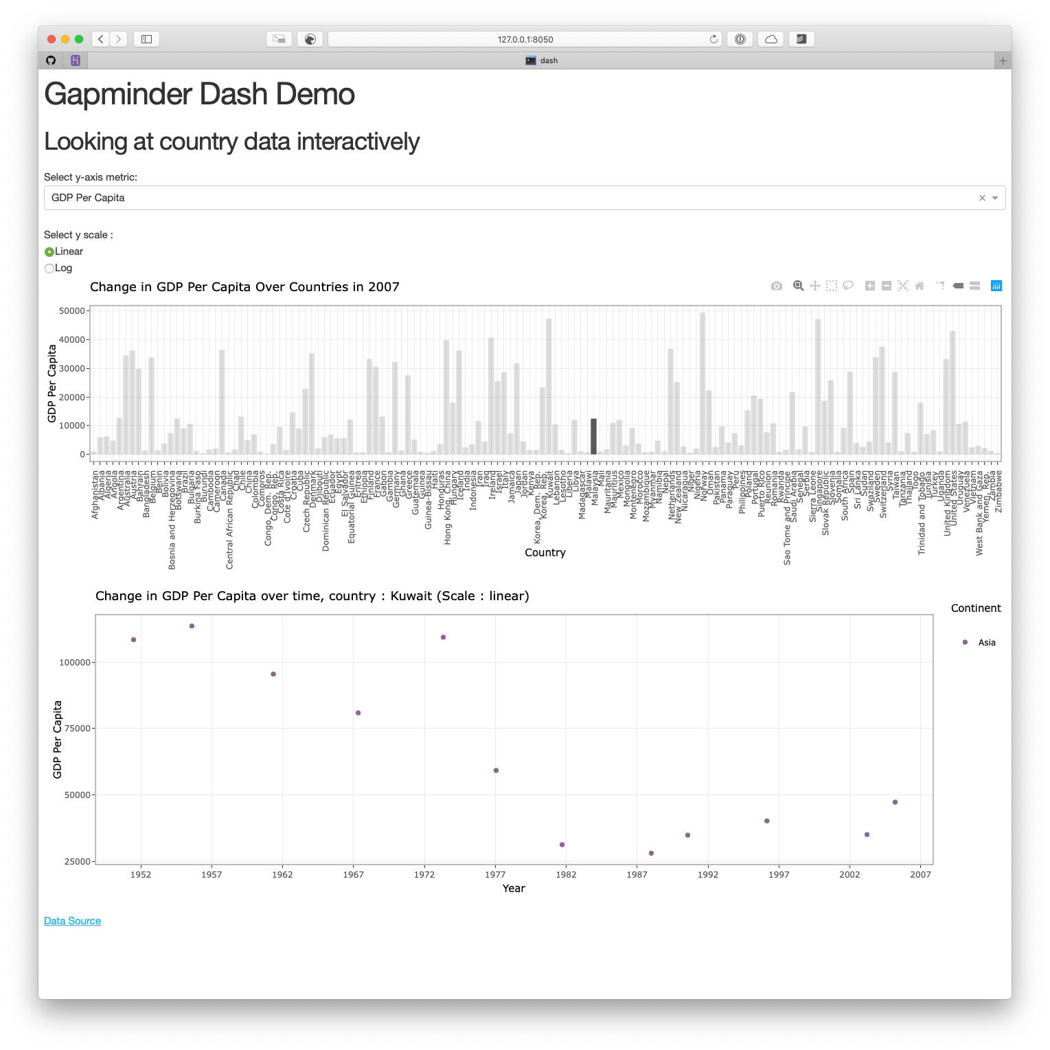
In this example, we are also going to use the app we created last lecture as a starting point. We are going to add a bar graph above the scatter plot. This bar graph is going to represent the variable the user select from the dropdown menu on the y-axis, and the x-axis is going to be the countries. To make it simpler, we are just going to represent the data from the year 2007 on this graph. The point of this exercise it to update the scatter plot so that it represents only the country the user is going to select on the bar graph.
Step 0 : create the new graph
The first thing we have to do is to create the bar graph.
make_bar <- function(yaxis="gdpPercap",
                     scale = "linear"){

  # gets the label matching the column value
  y_label <- yaxisKey$label[yaxisKey$value==yaxis]

  #filter our data based on the year/continent selections
  data <- gapminder %>%
    filter(year == 2007)

  # make the plot
  p <- ggplot(data, aes(x=country, y=!!sym(yaxis))) +
    geom_bar(stat='identity') +
    xlab("Country") +
    ylab(y_label) +
    ggtitle(paste0("Change in ", y_label, " Over Countries in 2007 ")) +
    theme_bw() +
    theme(axis.text.x = element_text(angle = 90, hjust = 1))

    if (scale == 'log'){
      p <- p + scale_y_continuous(trans='log10')
    }

    ggplotly(p)
}
Let’s add it to our original app, and create the corresponding Dash component :
# author: YOUR NAME
# date: THE DATE

"This script is the main file that creates a Dash app for cm108 on the gapminder dataset.

Usage: app.R
"

## Load libraries
library(dash)
library(dashCoreComponents)
library(dashHtmlComponents)
library(dashTable)
library(tidyverse)
library(plotly)
library(gapminder)

## Make plots
####NEW : Create the plot
make_bar <- function(yaxis="gdpPercap",
                     scale = "linear"){

  # gets the label matching the column value
  y_label <- yaxisKey$label[yaxisKey$value==yaxis]

  #filter our data based on the year/continent selections
  data <- gapminder %>%
    filter(year == 2007)

  # make the plot
  p <- ggplot(data, aes(x=country, y=!!sym(yaxis))) +
    geom_bar(stat='identity') +
    xlab("Country") +
    ylab(y_label) +
    ggtitle(paste0("Change in ", y_label, " Over Countries in 2007 ")) +
    theme_bw() +
    theme(axis.text.x = element_text(angle = 90, hjust = 1))

    if (scale == 'log'){
      p <- p + scale_y_continuous(trans='log10')
    }

    ggplotly(p)
}

make_plot <- function(yaxis = "gdpPercap",
                                            scale = "linear"){

    # gets the label matching the column value
    y_label <- yaxisKey$label[yaxisKey$value==yaxis]

    #filter our data based on the year/continent selections
    data <- gapminder
    # make the plot!
    p <- ggplot(data, aes(x = year, y = !!sym(yaxis), colour = continent)) +
        geom_jitter(alpha = 0.6) +
        scale_color_manual(name = 'Continent', values = continent_colors) +
        scale_x_continuous(breaks = unique(data$year))+
        xlab("Year") +
        ylab(y_label) +
        ggtitle(paste0("Change in ", y_label, " over time (Scale : ", scale, ")")) +
        theme_bw()

    if (scale == 'log'){
        p <- p + scale_y_continuous(trans='log10')
    }
    # passing c("text") into tooltip only shows the contents of
    ggplotly(p, tooltip = c("text"))
}

## Assign components to variables

heading_title <- htmlH1('Gapminder Dash Demo')
heading_subtitle <- htmlH2('Looking at country data interactively')

# Storing the labels/values as a tibble means we can use this both
# to create the dropdown and convert colnames -> labels when plotting
yaxisKey <- tibble(label = c("GDP Per Capita", "Life Expectancy", "Population"),
                                     value = c("gdpPercap", "lifeExp", "pop"))
#Create the dropdown
yaxisDropdown <- dccDropdown(
    id = "y-axis",
    options = map(
        1:nrow(yaxisKey), function(i){
            list(label=yaxisKey$label[i], value=yaxisKey$value[i])
        }),
    value = "gdpPercap"
)

#Create the button
logbutton <- dccRadioItems(
    id = 'yaxis-type',
    options = list(list(label = 'Linear', value = 'linear'),
                                 list(label = 'Log', value = 'log')),
    value = 'linear'
)

####NEW : add the Dash component that corresponds to the bar graph
graph_bar <- dccGraph(
  id = 'gap-graph-bar',
  figure=make_bar() # gets initial data using argument defaults
)


graph <- dccGraph(
    id = 'gap-graph',
    figure=make_plot() # gets initial data using argument defaults
)

sources <- dccMarkdown("[Data Source](https://cran.r-project.org/web/packages/gapminder/README.html)")

## Create Dash instance

app <- Dash$new()

## Specify App layout

app$layout(
    htmlDiv(
        list(
            heading_title,
            heading_subtitle,
            #selection components
            htmlLabel('Select y-axis metric:'),
            yaxisDropdown,
            htmlIframe(height=15, width=10, style=list(borderWidth = 0)), #space
            htmlLabel('Select y scale : '),
            logbutton,
            #graph
            ####NEW : Display the bar graph
            graph_bar,
            graph,
            htmlIframe(height=20, width=10, style=list(borderWidth = 0)), #space
            sources
        )
    )
)

## App Callbacks

app$callback(
    #update figure of gap-graph
    output=list(id = 'gap-graph', property='figure'),
    #based on values of year, continent, y-axis components
    params=list(input(id = 'y-axis', property='value'),
                            input(id = 'yaxis-type', property='value')),
    #this translates your list of params into function arguments
    function(yaxis_value, yaxis_scale) {
        make_plot(yaxis_value, yaxis_scale)
    })

## Run app

app$run_server()

# command to add dash app in Rstudio viewer:
# rstudioapi::viewer("http://127.0.0.1:8050")
Now, if you run this code, you should see two graphs : the scatter plot we had last time, and a bar graph. The scatter plot should be dynamic (it should still change depending on what the user select in the dropdown menu), while the bar graph shouldn’t change for now.
Now, let’s link the two graphs together!
Step 1 : specify the action when you click on the first plot
Try to modify the make_bar function so that the name of the country the user selects is saved in the customdata argument. Try to also change the way the bar graph looks when the user selects a country (highlight the selected country).
make_bar <- function(yaxis="gdpPercap",
                     scale = "linear"){

  # gets the label matching the column value
  y_label <- yaxisKey$label[yaxisKey$value==yaxis]

  #filter our data based on the year/continent selections
  data <- gapminder %>%
    filter(year == 2007)

  # make the plot
  p <- ggplot(data, aes(x=country, y=!!sym(yaxis), customdata=country)) +
    geom_bar(stat='identity') +
    xlab("Country") +
    ylab(y_label) +
    ggtitle(paste0("Change in ", y_label, " Over Countries in 2007 ")) +
    theme_bw() +
    theme(axis.text.x = element_text(angle = 90, hjust = 1))

    if (scale == 'log'){
      p <- p + scale_y_continuous(trans='log10')
    }

    ggplotly(p) %>%
      layout(clickmode = 'event+select')
}
Step 2 : change the make_plot function so that it takes the country as an argument
We have to add country as an argument of the make_plot function so that we can plot only the points that correspond to those countries.
all_countries <- unique(gapminder$country)

make_plot <- function(yaxis = "gdpPercap",
                      scale = "linear",
                      country_selected = all_countries){

  # gets the label matching the column value
  y_label <- yaxisKey$label[yaxisKey$value==yaxis]

  #filter our data based on the year/continent selections
  data <- gapminder %>%
    filter(country %in% country_selected)
  # make the plot!

  # NEW: the customdata mapping adds country to the tooltip and allows
  # its selection using clickData.

  p <- ggplot(data, aes(x = year, y = !!sym(yaxis),
                        colour = continent)) +
    geom_jitter(alpha=0.6) +
    scale_color_manual(name = 'Continent', values = continent_colors) +
    scale_x_continuous(breaks = unique(data$year))+
    xlab("Year") +
    ylab(y_label) +
    ggtitle(paste0("Change in ", y_label, " over time, country : ", country_selected, " (Scale : ", scale, ")")) +
    theme_bw()

  if (scale == 'log'){
    p <- p + scale_y_continuous(trans='log10')
  }

  ggplotly(p)

}
Step 3 : create the callback
It’s time to link our two plots. You have two callbacks to do/update.
The first callback is to update the bar graph depending on the values for the y-axis and the scale for the y-axis the user chose.
The second callback is to update the scatter plot depending on the values for the y-axis and the scale for the y-axis the user chose from the dropdown menu, and the country the user selected from the bar graph. Be careful,
clickData$points[[1]]$customdatais going to beNULLwhen the app will load for the first time. If you don’t want your scatter plot to be empty when the user opens the page, you have to create aforloop to avoid this issue.
app$callback(
  #update figure of gap-graph-bar
  output=list(id = 'gap-graph-bar', property='figure'),
  #based on values of year, continent, y-axis components
  params=list(input(id = 'y-axis', property='value'),
              input(id = 'yaxis-type', property='value')),
  #this translates your list of params into function arguments
  function(yaxis_value, yaxis_scale) {
    make_bar(yaxis_value, yaxis_scale)
  })

app$callback(output = list(id = 'gap-graph', property = 'figure'),
             params = list(input(id='y-axis', property='value'),
                           input(id = 'yaxis-type', property='value'),
                           # Here's where we check for graph interactions!
                           input(id='gap-graph-bar', property='clickData')),
             function(yaxis_value, yaxis_scale, clickData) {
               # clickData contains $x, $y and $customdata
               # you can't access these by gapminder column name!
               country_name = clickData$points[[1]]$customdata
               if (is.null(country_name)) {
                 country_name <- unique(gapminder$country)
               }
               make_plot(yaxis_value, yaxis_scale, country_name)
             })
Step 4 : Put it all together
This is the last step, gather all the chunks of code we created so far, and run the app!
# author: YOUR NAME
# date: THE DATE

"This script is the main file that creates a Dash app for cm108 on the gapminder dataset.

Usage: app.R
"

## Load libraries
library(dash)
library(dashCoreComponents)
library(dashHtmlComponents)
library(dashTable)
library(tidyverse)
library(plotly)
library(gapminder)

## Make plot

make_bar <- function(yaxis="gdpPercap",
                     scale = "linear"){

  # gets the label matching the column value
  y_label <- yaxisKey$label[yaxisKey$value==yaxis]

  #filter our data based on the year/continent selections
  data <- gapminder %>%
    filter(year == 2007)

  # make the plot
  p <- ggplot(data, aes(x=country, y=!!sym(yaxis) ,customdata=country)) +
    geom_bar(stat='identity') +
    xlab("Country") +
    ylab(y_label) +
    ggtitle(paste0("Change in ", y_label, " Over Countries in 2007 ")) +
    theme_bw() +
    theme(axis.text.x = element_text(angle = 90, hjust = 1))

    if (scale == 'log'){
      p <- p + scale_y_continuous(trans='log10')
    }

    ggplotly(p) %>%
      # NEW: this is optional but changes how the graph appears on click
      # more layout stuff: https://plotly-r.com/improving-ggplotly.html
      layout(clickmode = 'event+select')
}

all_countries <- unique(gapminder$country)

make_plot <- function(yaxis = "gdpPercap",
                      scale = "linear",
                      country_selected = all_countries){

  # gets the label matching the column value
  y_label <- yaxisKey$label[yaxisKey$value==yaxis]

  #filter our data based on the year/continent selections
  data <- gapminder %>%
    filter(country %in% country_selected)
  # make the plot!

  # NEW: the customdata mapping adds country to the tooltip and allows
  # its selection using clickData.

  p <- ggplot(data, aes(x = year, y = !!sym(yaxis),
                        colour = continent)) +
    geom_jitter(alpha=0.6) +
    scale_color_manual(name = 'Continent', values = continent_colors) +
    scale_x_continuous(breaks = unique(data$year))+
    xlab("Year") +
    ylab(y_label) +
    ggtitle(paste0("Change in ", y_label, " over time, country : ", country_selected, " (Scale : ", scale, ")")) +
    theme_bw()

  if (scale == 'log'){
    p <- p + scale_y_continuous(trans='log10')
  }

  ggplotly(p)

}


## Assign components to variables

heading_title <- htmlH1('Gapminder Dash Demo')
heading_subtitle <- htmlH2('Looking at country data interactively')

# Storing the labels/values as a tibble means we can use this both
# to create the dropdown and convert colnames -> labels when plotting
yaxisKey <- tibble(label = c("GDP Per Capita", "Life Expectancy", "Population"),
                   value = c("gdpPercap", "lifeExp", "pop"))
#Create the dropdown
yaxisDropdown <- dccDropdown(
  id = "y-axis",
  options = map(
    1:nrow(yaxisKey), function(i){
      list(label=yaxisKey$label[i], value=yaxisKey$value[i])
    }),
  value = "gdpPercap"
)

#Create the button
logbutton <- dccRadioItems(
  id = 'yaxis-type',
  options = list(list(label = 'Linear', value = 'linear'),
                 list(label = 'Log', value = 'log')),
  value = 'linear'
)

graph <- dccGraph(
  id = 'gap-graph',
  figure=make_plot() # gets initial data using argument defaults
)

graph_bar <- dccGraph(
  id = 'gap-graph-bar',
  figure=make_bar() # gets initial data using argument defaults
)

sources <- dccMarkdown("[Data Source](https://cran.r-project.org/web/packages/gapminder/README.html)")

## Create Dash instance

app <- Dash$new(external_stylesheets = "https://codepen.io/chriddyp/pen/bWLwgP.css")

## Specify App layout

app$layout(
  htmlDiv(
    list(
      heading_title,
      heading_subtitle,
      #selection components
      htmlLabel('Select y-axis metric:'),
      yaxisDropdown,
      htmlIframe(height=15, width=10, style=list(borderWidth = 0)), #space
      htmlLabel('Select y scale : '),
      logbutton,
      #graph
      graph_bar,
      graph,
      htmlIframe(height=20, width=10, style=list(borderWidth = 0)), #space
      sources
    )
  )
)

## App Callbacks

app$callback(
  #update figure of gap-graph-bar
  output=list(id = 'gap-graph-bar', property='figure'),
  #based on values of year, continent, y-axis components
  params=list(input(id = 'y-axis', property='value'),
              input(id = 'yaxis-type', property='value')),
  #this translates your list of params into function arguments
  function(yaxis_value, yaxis_scale) {
    make_bar(yaxis_value, yaxis_scale)
  })

app$callback(output = list(id = 'gap-graph', property = 'figure'),
             params = list(input(id='y-axis', property='value'),
                           input(id = 'yaxis-type', property='value'),
                           # Here's where we check for graph interactions!
                           input(id='gap-graph-bar', property='clickData')),
             function(yaxis_value, yaxis_scale, clickData) {
               # clickData contains $x, $y and $customdata
               # you can't access these by gapminder column name!
               country_name = clickData$points[[1]]$customdata
               if (is.null(country_name)) {
                 country_name <- unique(gapminder$country)
               }
               make_plot(yaxis_value, yaxis_scale, country_name)
             })


## Run app

app$run_server()

# command to add dash app in Rstudio viewer:
# rstudioapi::viewer("http://127.0.0.1:8050")
This is it! Now, you know how to update a graph using another one!