Class Meeting 13 Effective Visualizations
Now that you know how to create graphics and visualizations in R, you are armed with powerful tools for scientific computing and analysis. With this power also comes great responsibility. Effective visualizations is an incredibly important aspect of scientific research and communication. There have been several books (see references) written about these principles. In class today we will be going through several case-studies trying to develop some expertise into making effective visualizations.
13.1 Worksheet
The worksheet questions for today are embedded into the class notes.
You can download this Rmd file here
Note, there will be very little coding in-class today, but I’ve given you plenty of exercises in the form of a supplemental worksheet (linked at the bottom of this page) to practice with after class is over.
13.2 Resources
Fundamentals of Data Visualization by Claus Wilke.
Visualization Analysis and Design by Tamara Munzner.
STAT545.com - Effective Graphics by Jenny Bryan.
ggplot2 book by Hadley Wickam.
Callingbull.org by Carl T. Bergstrom and Jevin West.
13.3 Part 1: Warm-up and pre-test [20 mins]
13.3.1 Warmup:
Write some notes here about what “effective visualizations” means to you. Think of elements of good graphics and plots that you have seen - what makes them good or bad? Write 3-5 points.
13.3.2 CQ01: Weekly hours for full-time employees
Question: Evaluate the strength of the claim based on the data: “German workers are more motivated and work more hours than workers in other EU nations.”
Very strong, strong, weak, very week, do not know
<<Your answer here (and make sure to explain why you chose this answer)>>
Main takeaway: Summarize the main takeaway from this question/discussion here
13.3.3 CQ02: Average Global Temperature by year
Question: For the years this temperature data is displayed, is there an appreciable increase in temperature?
Yes, No, Do not know
<<Your answer here (and make sure to explain why you chose this answer)>>
Main takeaway: Summarize the main takeaway from this question/discussion here
13.3.4 CQ03: Gun deaths in Florida
Question: Evaluate the strength of the claim based on the data: “Soon after this legislation was passed, gun deaths sharply declined.”
Very strong, strong, weak, very week, do not know
<<Your answer here (and make sure to explain why you chose this answer)>>
Main takeaway: Summarize the main takeaway from this question/discussion here
13.4 Part 2: Extracting insight from visualizations [20 mins]
Great resource for selecting the right plot: https://www.data-to-viz.com/ ; encourage you all to consult it when choosing to visualize data.
13.5 Part 3: Principles of effective visualizations [20 mins]
We will be filling these principles in together as a class (unfortunately we didn’t get to do this in class, but here are the notes)
- Apply Principle of proportional ink
- Definition: “The amount of ink used to indicate a value should be proportional to the value itself.”
- Example: Truncating the y-axis on a bar chart to exaggerate the difference between bars violates the principle of proportional ink
- Maintain a high data-to-ink ratio: less is more
- Definition: remove distracting visual elements to focus attention on the data
- Examples: Lighten line weights, remove backgrounds, never use 3D or special effects, remove unnecessary/redundant labels, etc…
- Always update axes labels and titles on your plots
- In STAT545/547 we take principles of effective visualizations very seriously and you will lose marks if this isn’t followed
- Choose your scale-type carefully
- Whether you choose a linear, logarithm, sqrt scale depends on your data, context, and purpose
- Choose your graph-type carefully
- Examples: here is a great directory of plots
- Choose colours with accessibility and readability in mind
- Examples: here is a great set of colour schemes that are colour-blind friendly and perceptually uniform
13.5.1 Make a great plot worse
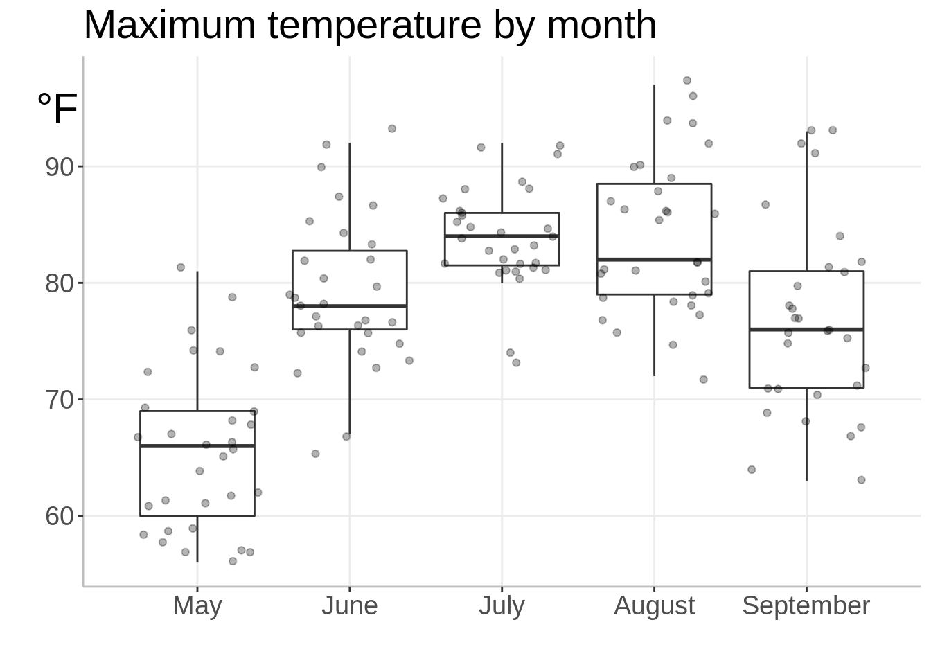
Instructions: Below is a code chunk that shows an effective visualization. First, copy this code chunk into a new cell. Then, modify it to purposely make this chart “bad” by breaking the principles of effective visualization above. Your final chart still needs to run/compile and it should still produce a plot.
## Error in library("plotly"): there is no package called 'plotly'library("tidyverse")
ggplot(airquality, aes(`Month`, `Temp`, group = `Month`)) +
geom_boxplot(outlier.shape = NA) +
geom_jitter(alpha = 0.3) +
labs(x = "",
y = "",
title="Maximum temperature by month")+
theme_bw() +
scale_x_continuous(breaks=c(5,6,7,8,9),labels=c("May","June","July","August","September")) +
annotate("text", x = 4.08, y = 95,label="°F",size=8) +
coord_cartesian(xlim = c(4.5, 9.5),
clip = 'off')+
theme(panel.grid.minor = element_blank(),
panel.background = element_blank(),
axis.line = element_line(colour = "gray"),
panel.border = element_blank(),
text = element_text(size=18)
)
How many of the principles did you manage to break?
13.6 Plotly demo [10 mins]
Did you know that you can make interactive graphs and plots in R using the plotly library? We will show you a demo of what plotly is and why it’s useful, and then you can try converting a static ggplot graph into an interactive plotly graph.
This is a preview of what we’ll be doing in STAT 547 - making dynamic and interactive dashboards using R!
For this demo, make sure you have the following packages installed and loaded:
## Error in library(plotly): there is no package called 'plotly'13.6.1 Make ggplot2 graphs interactive
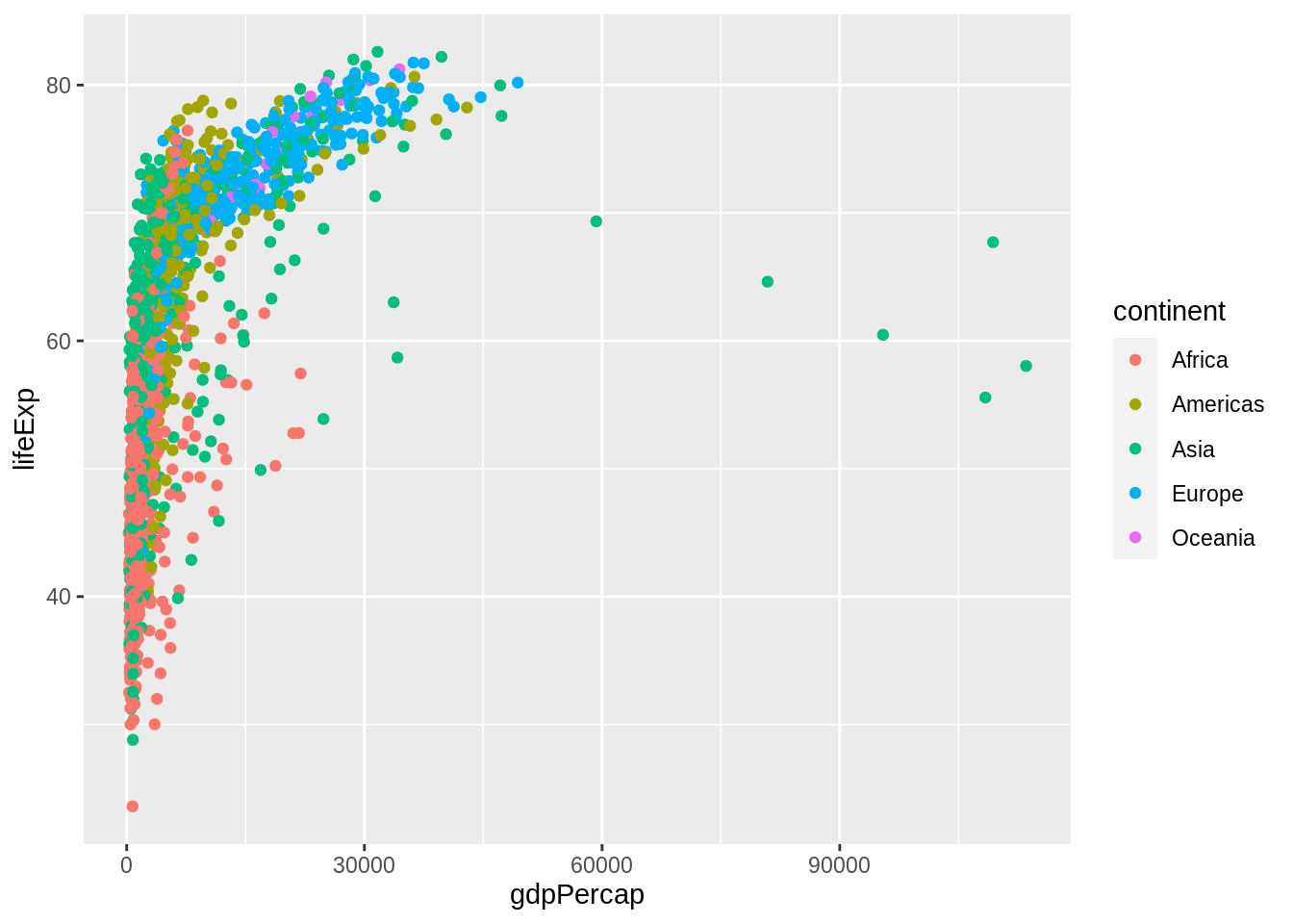
It’s very easy to convert an existing ggplot2 graph into an interactive graph with plotly::ggplotly
On the below graph, explore the interactive options:
- Hover your cursor over individual points
- Zoom in and out by dragging across / using the zoom tool
- Single- and double-click items on the legend to isolate groups of points
- While zoomed-in, use the pan tool to “move” around the plot, google maps style!
p <- gapminder %>%
    ggplot(aes(x = gdpPercap, y = lifeExp, color = continent)) +
    geom_point()

p %>%
    ggplotly()
## Error in ggplotly(.): could not find function "ggplotly"13.6.2 Make interactive plots with plotly::plot_ly
We can also make interactive graphs using the the plotly::plot_ly function:
p <- gapminder %>%
    plot_ly(x = ~gdpPercap,
            y = ~lifeExp,
            color = ~continent,

            # mode specifies the geometric object e.g. "markers" for points, "line" for lines
            mode = 'markers',

            # type controls the "type" of graph e.g. 'bar', 'scatter'
            type = 'scatter'
            )
## Error in plot_ly(., x = ~gdpPercap, y = ~lifeExp, color = ~continent, : could not find function "plot_ly"
13.7 Supplemental worksheet (Optional)
You are highly encouraged to the cm013 supplemental exercises worksheet. It is a great guide that will take you through Scales, Colours, and Themes in ggplot. There is also a short guided activity showing you how to make a ggplot interactive using plotly.