Class Meeting 5 Intro to plotting with ggplot2, Part I
Announcements:
- Homework 1 is due tonight. Your work should be stored in your homework repository, not your partication repo! Also, please put your URL on canvas.
Recap:
- Previous two weeks: software for data analytic work: git & GitHub, markdown, and R.
- Next three weeks: fundamental methods in exploratory data analysis: R tidyverse.
- Last two weeks (and STAT 547M): special topics in exploratory data analysis.
Today: Introduction to plotting with ggplot2 (to be continued next Thursday).
Worksheet: You can find a worksheet template for today here.
Set up the workspace:
suppressPackageStartupMessages(library(tidyverse))
suppressPackageStartupMessages(library(gapminder))
suppressPackageStartupMessages(library(scales))
knitr::opts_chunk$set(fig.width = 5, fig.height = 2, fig.align = "center")
5.1 Learning Objectives
By the end of this lesson, students are expected to be able to:
- Identify the plotting framework available in R
- Have a sense of why we’re learning the
ggplot2tool - Have a sense of the importance of statistical graphics in communicating information
- Identify the seven components of the grammar of graphics underlying
ggplot2 - Use different geometric objects and aesthetics to explore various plot types.
5.2 Resources (2 min)
For me, I learned ggplot2 from Stack Overflow by googling error messages or “how to … in ggplot2” queries, together with persistence. It might take you a bit longer to make a graph using ggplot2 if you’re unfamiliar with it, but persistence pays off.
Here are some good walk-throughs that introduce ggplot2, in a similar way to today’s lesson:
- r4ds: data-vis chapter.
- Perhaps the most compact “walk-through” style resource.
- The ggplot2 book, Chapter 2.
- A bit more comprehensive “walk-through” style resource.
- Section 1.2 introduces the actual grammar components.
- Jenny’s ggplot2 tutorial.
- Has a lot of examples, but less dialogue.
Here are some good resource to use as a reference:
ggplot2cheatsheet- R Graphics Cookbook
- Good as a reference if you want to learn how to make a specific type of plot.
5.3 Orientation to plotting in R (7 min)
TL;DR: We’re using ggplot2 in STAT 545, and a little bit of plotly.
Traditionally, plots in R are produced using “base R” methods, the crown function here being plot(). This method tends to be quite involved, and requires a lot of “coding by hand”.
Then, an R package called lattice was created that aimed to make it easier to create multiple “panels” of plots. It seems to have gone to the wayside in the R community. Personally, I found that using this package often involved several lines of code to set up a plot, which then needed to get overriden by “special cases”.
After lattice came ggplot2, which provides a very powerful and relatively simple framework for making plots. It has a theoretical underpinning, too, based on the Grammar of Graphics, first described by Leland Wilkinson in his “Grammar of Graphics” book. With ggplot2, you can make a great many type of plots with minimal code. It’s been a hit in and outside of the R community.
Check out this comparison of the three by Joseph V. Casillas.
A newer tool is called plotly, which was actually developed outside of R, but the plotly R package accesses the plotly functionality. Plotly graphs allow for interactive exploration of a plot. You can convert ggplot2 graphics to a plotly graph, too.
5.4 Just plot it (7 min)
The human visual cortex is a powerful thing. If you’re wanting to point someone’s attention to a bunch of numbers, I can assure you that you won’t elicit any “aha” moments by displaying a large table like this, either in a report or (especially!) a presentation. Make a plot to communicate your message.
If you really feel the need to tell your audience exactly what every quantity evaluates to, consider putting your table in an appendix. Because chances are, the reader doesn’t care about the exact numeric values. Or, perhaps you just want to point out one or a few numbers, in which case you can put that number directly on a plot.
5.5 The grammar of graphics (15 min)
You can think of the grammar of graphics as a systematic approach for describing the components of a graph. It has seven components (the ones in bold are required to be specifed explicitly in ggplot2):
- Data
- Exactly as it sounds: the data that you’re feeding into a plot.
- Aesthetic mappings
- This is a specification of how you will connect variables (columns) from your data to a visual dimension. These visual dimensions are called “aesthetics”, and can be (for example) horizontal positioning, vertical positioning, size, colour, shape, etc.
- Geometric objects
- This is a specification of what object will actually be drawn on the plot. This could be a point, a line, a bar, etc.
- Scales
- This is a specification of how a variable is mapped to its aesthetic. Will it be mapped linearly? On a log scale? Something else?
- Statistical transformations
- This is a specification of whether and how the data are combined/transformed before being plotted. For example, in a bar chart, data are transformed into their frequencies; in a box-plot, data are transformed to a five-number summary.
- Coordinate system
- This is a specification of how the position aesthetics (x and y) are depicted on the plot. For example, rectangular/cartesian, or polar coordinates.
- Facet
- This is a specification of data variables that partition the data into smaller “sub plots”, or panels.
These components are like parameters of statistical graphics, defining the “space” of statistical graphics. In theory, there is a one-to-one mapping between a plot and its grammar components, making this a useful way to specify graphics.
5.5.1 Example: Scatterplot grammar
For example, consider the following plot from the gapminder data set. For now, don’t focus on the code, just the graph itself.
ggplot(gapminder, aes(gdpPercap, lifeExp)) +
  geom_point(alpha = 0.1) +
  scale_x_log10("GDP per capita", labels = scales::dollar_format()) +
  theme_bw() +
  ylab("Life Expectancy")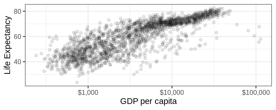
This scatterplot has the following components of the grammar of graphics.
| Grammar Component | Specification |
|---|---|
| data | gapminder |
| aesthetic mapping | x: gdpPercap, y: lifeExp |
| geometric object | points |
| scale | x: log10, y: linear |
| statistical transform | none |
| coordinate system | rectangular |
| facetting | none |
Note that x and y aesthetics are required for scatterplots (or “point” geometric objects). In general, each geometric object has its own required set of aesthetics.
5.5.2 Activity: Bar chart grammar
Fill out Exercise 1: Bar Chart Grammar (Together) in your worksheet.
Click here if you don’t have it yet.
5.6 Working with ggplot2 (40 min)
First, the ggplot2 package comes with the tidyverse meta-package. So, loading that is enough.
There are two main ways to interact with ggplot2:
- The
qplot()orquickplot()functions (the two are identical): Useful for making a quick plot if you have vectors stored in your workspace that you’d like to plot. Usually not worthwhile using. - The
ggplot()function: use to access the full power ofggplot2.
Let’s use the above scatterplot as an example to see how to use the ggplot() function.
First, the ggplot() function takes two arguments:
- data: the data frame containing your plotting data.
- mapping: aesthetic mappings applying to the entire plot. Expecting the output of the aes() function.
Notice that the aes() function has x and y as its first two arguments, so we don’t need to explicitly name these aesthetics.
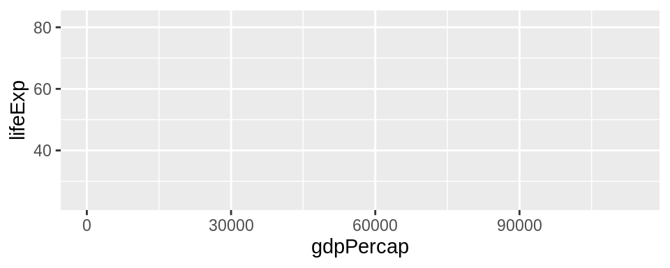
This just initializes the plot. You’ll notice that the aesthetic mappings are already in place. Now, we need to add components by adding layers, literally using the + sign. These layers are functions that have further specifications.
For our next layer, let’s add a geometric object to the plot, which have the syntax geom_SOMETHING(). There’s a bit of overplotting, so we can specify some alpha transparency using the alpha argument (you can interpret alpha as neeing 1/alpha points overlaid to achieve an opaque point).
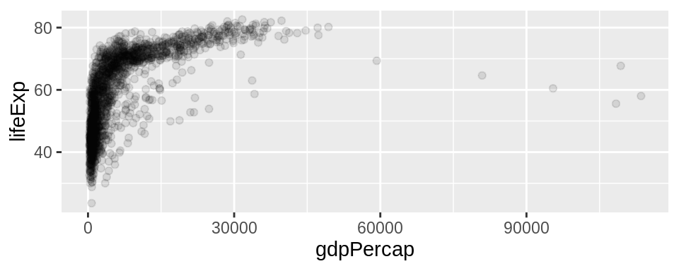
That’s the only geom that we’re wanting to add. Now, let’s specify a scale transformation, because the plot would really benefit if the x-axis is on a log scale. These functions take the form scale_AESTHETIC_TRANSFORM(). As usual, you can tweak this layer, too, using this function’s arguments. In this example, we’re re-naming the x-axis (the first argument), and changing the labels to have a dollar format (a handy function thanks to the scales package).
ggplot(gapminder, aes(gdpPercap, lifeExp)) +
geom_point(alpha = 0.1) +
scale_x_log10("GDP per capita", labels = scales::dollar_format())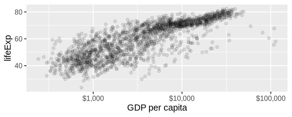
I’m tired of seeing the grey background, so I’ll add a theme() layer. I like theme_bw(). Then, I’ll re-label the y-axis using the ylab() function. Et voilà!
ggplot(gapminder, aes(gdpPercap, lifeExp)) +
  geom_point(alpha = 0.1) +
scale_x_log10("GDP per capita", labels = scales::dollar_format()) +
theme_bw() +
ylab("Life Expectancy")
5.6.1 Activity: Plotting
- Go to your worksheet
- Set up the workspace by following the instructions in the “Preliminary” section.
- Fill out Exercise 2:
ggplot2Syntax (Your Turn) in your worksheet.
Bus stop: Did you lose track of where we are? You can still do the exercise!
- Click here to obtain the worksheet if you don’t have it.
- You’re all set! Hint for completing the exercise: use the information from this section (“Working with
ggplot2”) to complete the exercise.