Class Meeting 8 Intro to plotting with ggplot2, Part II
8.1 Orientation
8.1.1 Worksheet
You can find a worksheet template for today here.
8.1.2 Announcements
From Assignment 3 onwards, whenever you produce an HTML file, you must link to a rendered version of the file. We’ll cover this today.
8.1.3 Today
- GitHub Pages (15 min)
- Continue with
ggplot2: a tour of some importantgeoms (20 min) ggplot2exercises from the worksheet (40 min)
8.2 Participation repository and GitHub Pages (15 min)
8.2.1 GitHub Pages
You can turn your GitHub repository into a website, by enabling GitHub Pages on that repo. This is useful for something as small as being able to display HTML files without getting a local copy of the repository, to something as big as making a full fledged website like the stat545.stat.ubc.ca website.
- If you make a repo called
yourusername.github.io, and enable GitHub Pages on that repo, then the URL of the website will behttps://yourusername.github.io/. - If you enable GitHub pages on any other repo, the URL for that repo will be
https://yourusername.github.io/name_of_other_repo.
Learn more with GitHub’s GitHub Pages tutorial.
8.2.2 Practice with HTML file linking
We’ll practice linking to an HTML file for today’s exercise, by following the instructions on the (new!) “Viewing and Linking to HTML Files” on the assignments home page.
8.3 A tour of some important geoms (20 min)
Here, we’ll explore some common plot types, and how to produce them with ggplot2.
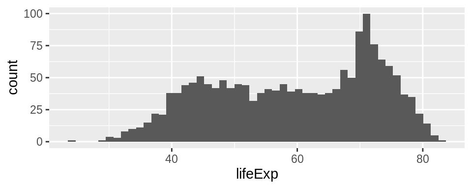
8.3.1 Histograms: geom_histogram()
Useful for depicting the distribution of a continuous random variable. Partitions the number line into bins of certain width, counts the number of observations falling into each bin, and erects a bar of that height for each bin.
Required aesthetics:
x: A numeric vector.
By default, a histogram plots the count on the y-axis. If you want to use proportion, specify the y = ..prop.. aesthetic.
You can change the smoothness of the plot via two arguments (your choice):
bins: the number of bins/bars shown in the plot.binwidth: the with of the bins shown on the plot.
Example:
8.3.2 Density: geom_density()
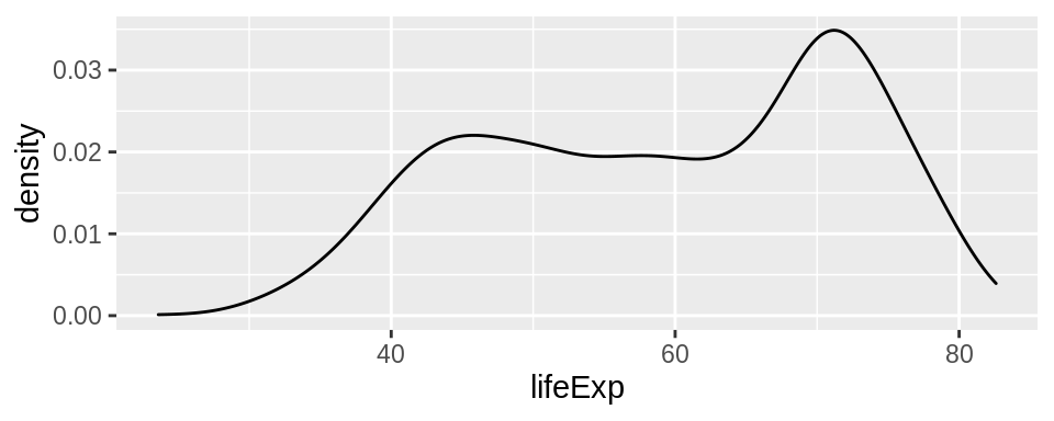
Essentially, a “smooth” version of a histogram. Uses kernels to produce the curve.
Required aesthetics:
x: A numeric vector.
Good to know:
bwargument controls the smoothness: Smaller = rougher.
Example:
8.3.3 Jitter plots: geom_jitter()
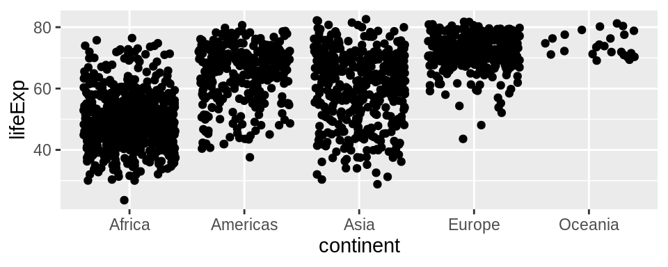
A scatterplot, but with minor random perturbations of each point. Useful for scatterplots where points are overlaying, or when one variable is categorical.
Required aesthetics:
x: any vectory: any vector
Example:
8.3.4 Box plots: geom_boxplot()
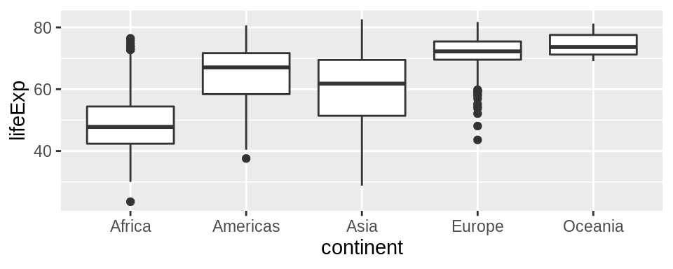
This geom makes a boxplot for a numeric variable in each of a category. Useful for visualizing probability distributions across different categories.
Required aesthetics:
x: A factor (categorical variable)y: A numeric variable
Example:
8.3.5 Ridge plots: ggridges::geom_density_ridges()
A (superior?) alternative to the boxplot, the ridge plot (also known as the joy plot) places a kernel density for each group, instead of the box.
You’ll need to install the ggridges package. You can do lots more with ridges – check out the ggridges intro vignette.
Required aesthetics (reversed from boxplots!)
x: A numeric variabley: A factor (categorical variable)
Example:
## Picking joint bandwidth of 2.23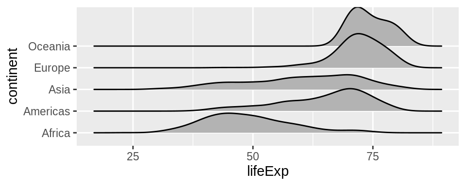
8.3.6 Bar plots: geom_bar() or geom_col()
These geom’s erect a bar over each category.
geom_bar() automatically determines the height of the bar according to the count of each category.
geom_col() requires a manual specification of the bar heights.
Required aesthetics:
x: A categorical variabley: A numeric variable (only required forgeom_col()!)- To use proportion in
geom_bar()instead of count, sety = ..prop..
- To use proportion in
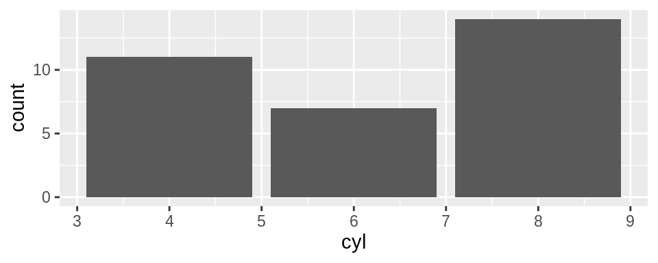
Example: number of 4-, 6-, and 8- cylinder cars in the mtcars dataset:
8.3.7 Line charts: geom_line()
A line plot connects points with straight lines, from left-to-right. Especially useful if time is on the x-axis.
Required aesthetics:
x: a variable having some ordering to it.y: a numeric variable.
Although not required, the group aesthetic will come in handy here. This aesthetic produces a plot independently for each group, and overlays the results.
tsibble::as_tsibble(co2) %>%
  rename(yearmonth = index,
         conc = value) %>%
  mutate(month = lubridate::month(yearmonth, label = TRUE),
         year  = lubridate::year(yearmonth)) %>%
  ggplot(aes(month, conc)) +
  geom_line(aes(group = year), alpha = 0.5) +
  ylab("CO2 Concentration")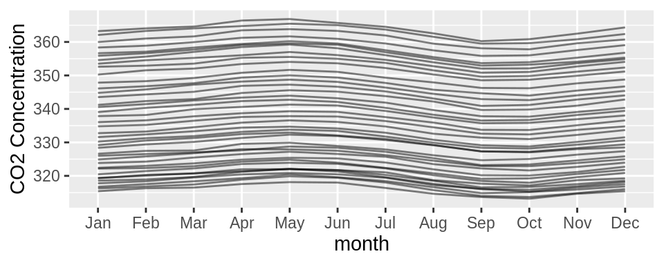
8.3.8 Path plots: geom_path()
Like geom_line(), except connects points in the order that they appear in the dataset.
8.4 Activity: Fix the Plots (40 min)
Fill out the worksheet together.
8.5 Time remaining?
If so, let’s make tibbles with tibble(), and make a list column while we’re at it. Maybe even nest() and unnest().